
PUBG Update 10.2 overhauls the console inventory with a faster 14-slot grid, four-way navigation, and adjustable controller sensitivity.
PUBG console survivors have spent years treating the inventory screen like a suspicious closet: everything is in there, but nobody wants to rummage through it while a squad is shooting at the door. Update 10.2 finally hands them a flashlight. The developers knew players were comfortable with the old system, so they aimed for a console-friendly overhaul with minimal disruption: fewer tab-hopping detours, a grid that actually moves in four directions, and a new sensitivity option for thumbs that need a warm-up. By 2026 standards, the 10.2 overhaul reads less like a flashy feature drop and more like a sensible tune-up—the sort of thing players notice only when it is missing.
The Old Closet Had a Few Squeaky Hinges
The original console inventory was not exactly a disaster, but it was not a victory lap either. Players could move up and down between slots with the D-pad, yet left and right movement was off the menu. Weapons and attachments lived in separate tabs, which turned a simple scope swap into a small administrative journey. Want to mount or dismount an attachment? Prepare for tab tourism. Want to change weapon slots? The steps piled up like unread patch notes. What could be more thrilling than losing a firefight because a player had to visit three tabs to attach a scope? Exactly.
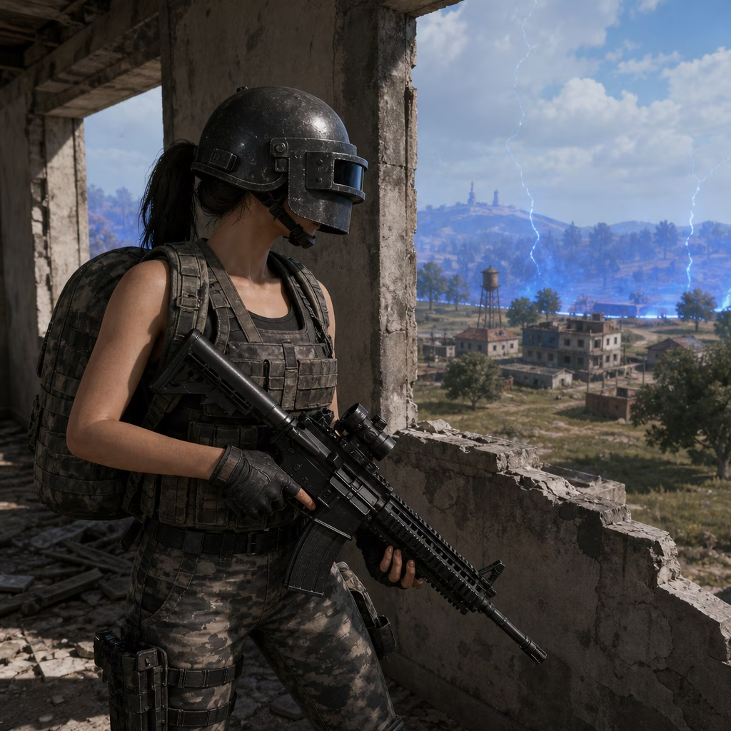
The developers openly acknowledged the awkwardness. They collected feedback, studied the pain points, and decided that the goal was not to reinvent inventory management for the sake of novelty. The goal was to make the existing experience faster, clearer, and less likely to end with a player staring at a menu while their health bar quietly disappears. The project carried a real concern: many players were familiar with the current system, and muscle memory is a stubborn creature. The answer was to improve the environment with minimal changes and less confusion.
What 10.2 Actually Wants to Achieve
The update has two headline ambitions. First, it improves the inventory slot specification so navigation feels less like fighting a rusty shopping cart. The maximum number of visible slots is limited to 14, while other sections remain the same as the current inventory. That number matters because it keeps the screen readable without turning it into a spreadsheet with a rifle attached.
Second, the update adds movement and adjustment features so players can select the desired item faster and easier. The promise is simple: pick the item, apply it, and get back to the battle before the enemy finishes reloading. The team also recognized that controller sensitivity is a legitimate concern. Free movement above, below, left, and right may feel a little odd at first, so a new configuration option lets players adjust the inventory controller sensitivity. Is that a small feature? Yes. Is it the difference between smooth looting and accidental interpretive dance? Also yes.
The UI Got a Console Haircut
The changes are not just about moving a cursor around. The UI layout was tailored to the console game environment and optimized for the UX. The character rendering image has been removed, which gives the inventory more breathing room. Animations now provide feedback for actions such as equipping or removing weapons and attachments. The tool-tip pop-up display has been fixed in place, so information appears where players expect it rather than wandering off like a confused chicken.
| Area | Old headache | 10.2 fix |
|---|---|---|
| Navigation | D-pad mostly up and down; tab hopping | Grid movement with up, down, left, and right |
| Weapons | Separate weapon and attachment tabs | Integrated weapon and attachment slot |
| Controller feel | One-size-fits-all sensitivity | Adjustable inventory controller sensitivity |
| Feedback | Static actions | Animations for equipping and removing gear |
| Screen space | Character rendering took room | Character rendering removed |
Grid Movement: Finally, Left and Right Exist
The headline UX change is grid movement. D-pad navigation now supports up, down, left, and right, giving players greater flexibility between tabs in grid form. When navigating left or right, the selection moves to the nearest tab. If there is no nearest tab, it goes to the very bottom of the column. That last detail sounds tiny, but it prevents the cursor from sulking in a corner while the player wonders what happened.
The R stick also gets in on the action and can be used similarly to a mouse. For console players, that is a meaningful quality-of-life upgrade. It means faster item selection and less time spent performing thumb gymnastics. The system is designed to let players return to battle more quickly by selecting and applying items with fewer interruptions.
Weapons and Attachments Stop Living in Separate Rooms
The weapon and attachment slot is now integrated. Players can select attachment and weapon options from the weapon status, which reduces the number of steps required to change weapon slots. A step has been removed, allowing quicker weapon slot changes. In practical terms, that means fewer menu visits and more time doing the thing everyone actually downloaded the game for: shooting at other survivors.
Does this make every player an inventory speedrunner overnight? Probably not. The first few sessions may include a moment of confused blinking as thumbs adjust to free grid movement. But the direction is clear. The update trims the awkward parts, keeps the familiar structure, and gives players more control over how the cursor behaves.
The developers have also invited feedback on the changes. That is sensible, because inventory design is one of those strange areas where a tiny annoyance can become a legendary grudge. PUBG console players now have a cleaner closet, a faster flashlight, and a grid that finally understands that left and right are real directions. See you on the battlegrounds—hopefully not while staring at a menu.